One of the most important, and most complicated, user interactions on the client's platform is how someone places an investment in a company that has a live fundraise. The previous iteration of the invest flow was designed for accredited investors before Regulation Crowdfunding was passed and implemented into law.
The client sought to redesign the flow and UI to focus on improving the experience for first-time, unaccredited investors. There was a major time constraint to complete the project in 10 days; I was able to meet the deadline by clearly defining users' goals early, and working closely with the development team.
Most investors who use the client's platform to invest have shifted from those who are (mostly) career investors, to those who have only invested once or twice in the stock market. How can we make the process of investing in eary-stage companies more accessible to new investors while giving them agency to make the right decisions with credible information? Additionally, how can we simplify the investing process so that repeat investors and new investors alike can invest with the least effort?
Investors are separated into three broad categories: new users, return users who have never invested, and repeat investors. The flow required new users to first create an investor profile before they could invest. The profile creation process was long, and asked users for a slew of information including their social security number and their income verification. As a result, there was a 60% drop-off rate between the sign up screen and the invest screen. For first-time investors who had already created a profile on the platform, there was not sufficient, up-front information about how equity crowdfunding works. Thus, the client often received support messages regarding common matters. For repeat investors, they needed to be able to invest as simply as possible. My goal in the redesign was to the decrease the drop-off rate for newcomers and increase investment rates for all investor segments.
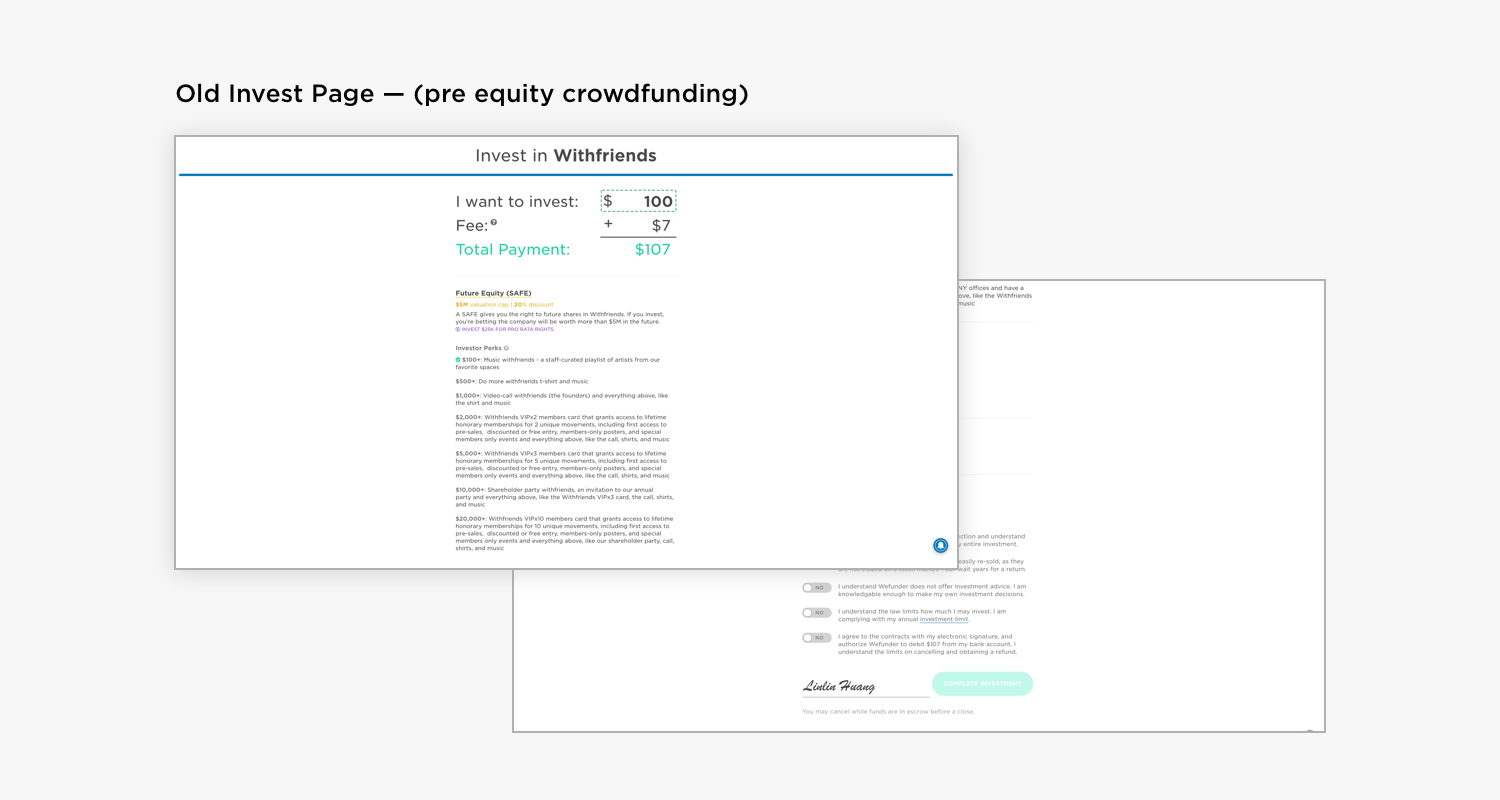 The invest page was difficult to parse visually and it was difficult for users to discern important information at a glance.
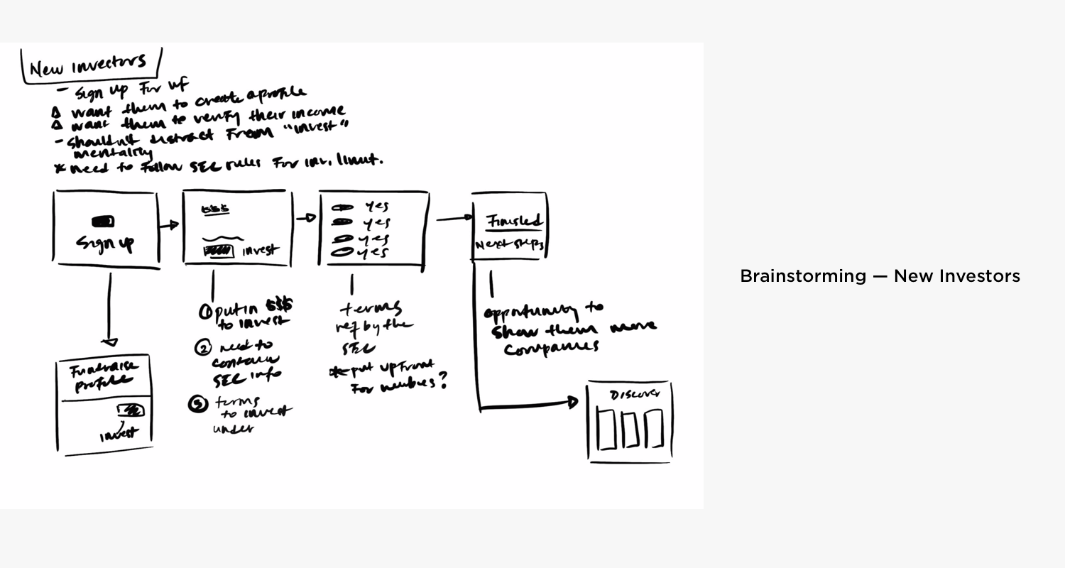
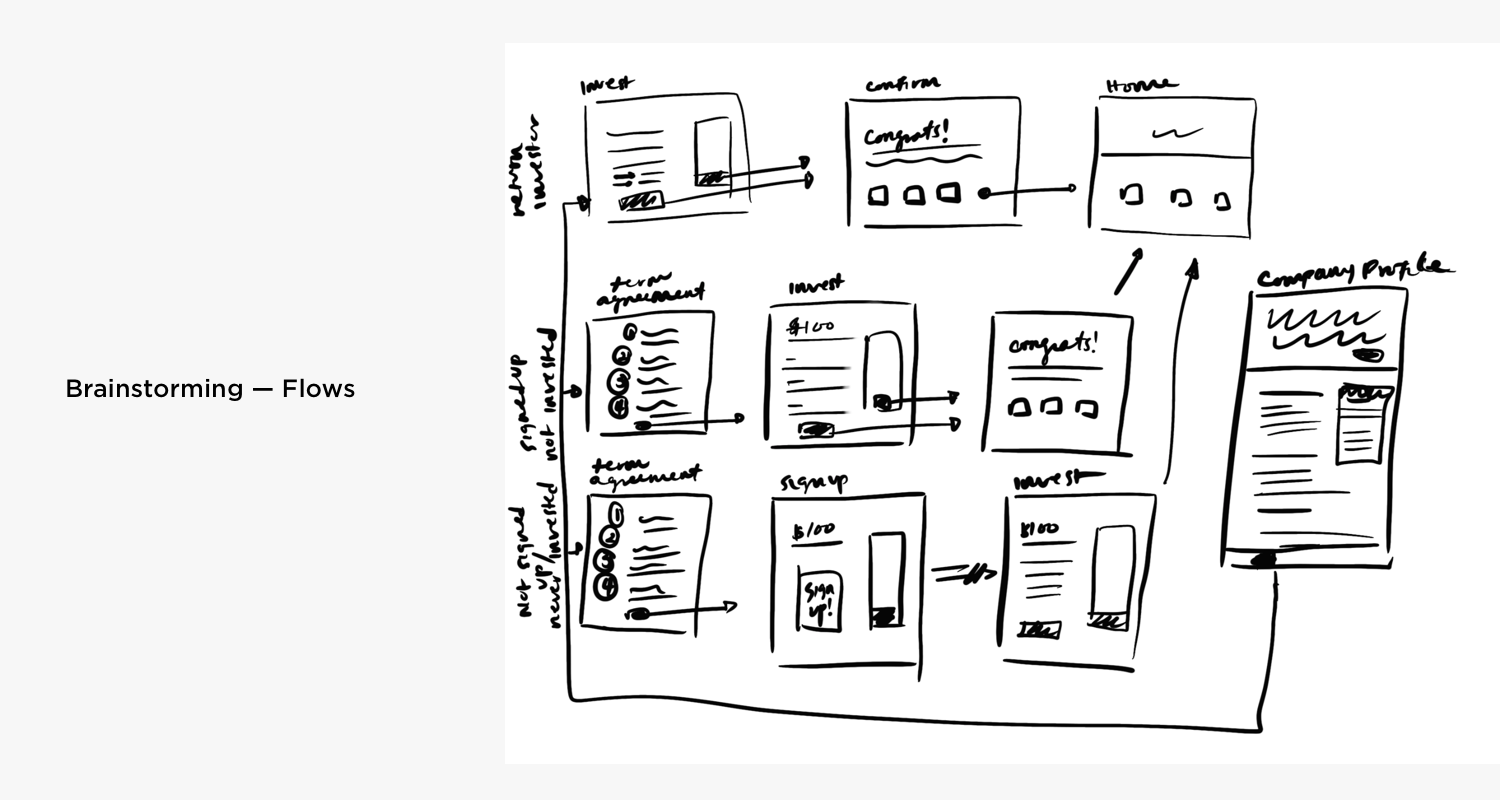
Below are some initial sketches I created as part of my process to better understand the problem and to formulate possible solutions.
What makes this flow complicated is that it needed to be in compliance with the rules that the SEC had set out regulating Crowdfunding. Small details like 12-month investment limits calculated based on self-reported income and net worth were important to get right but delicate to design for.
After digging deeper into the legal requirements by speaking to the compliance officer as well as the CEO, I redesigned the flow to better fit the mental model of new users and first-time investors, and to improve the experience of all investors.
The redesign of the flow simplified the experience for new users and first time investors by removing the upfront profile creation and income verification. Technically, investors do not need to provide that information unless they were to place an investment over $2,200 in value. Most crowdfunding investors do not invest that much on a single investment opportunity, so my redesigned flow asks for those details at a more fitting time and scenario.
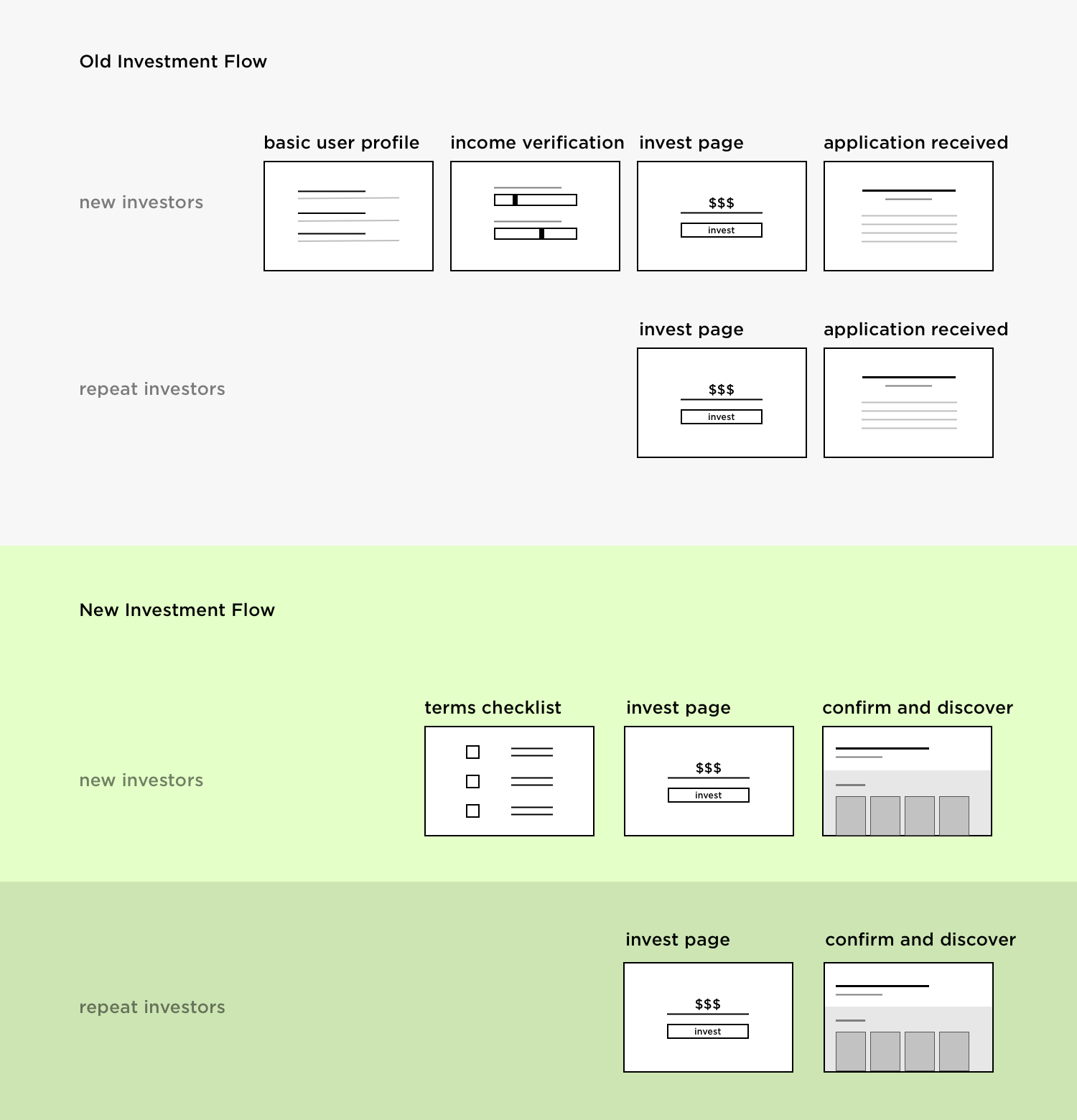
I also redesigned the information architecture of the investment confirmation page. Before, the page put a heavy emphasis on an investment application received messaging. Though it was the accurate way to describe the transaction, the language and information architecture confused investors. Furthermore, the client was missing out on an opportunity to show investors similar opportunities to support.
The new invest flow includes updated UI for the invest page, a new terms page for first-time investors, an integrated signup flow for new users, and a simplified information architecture for return investors.
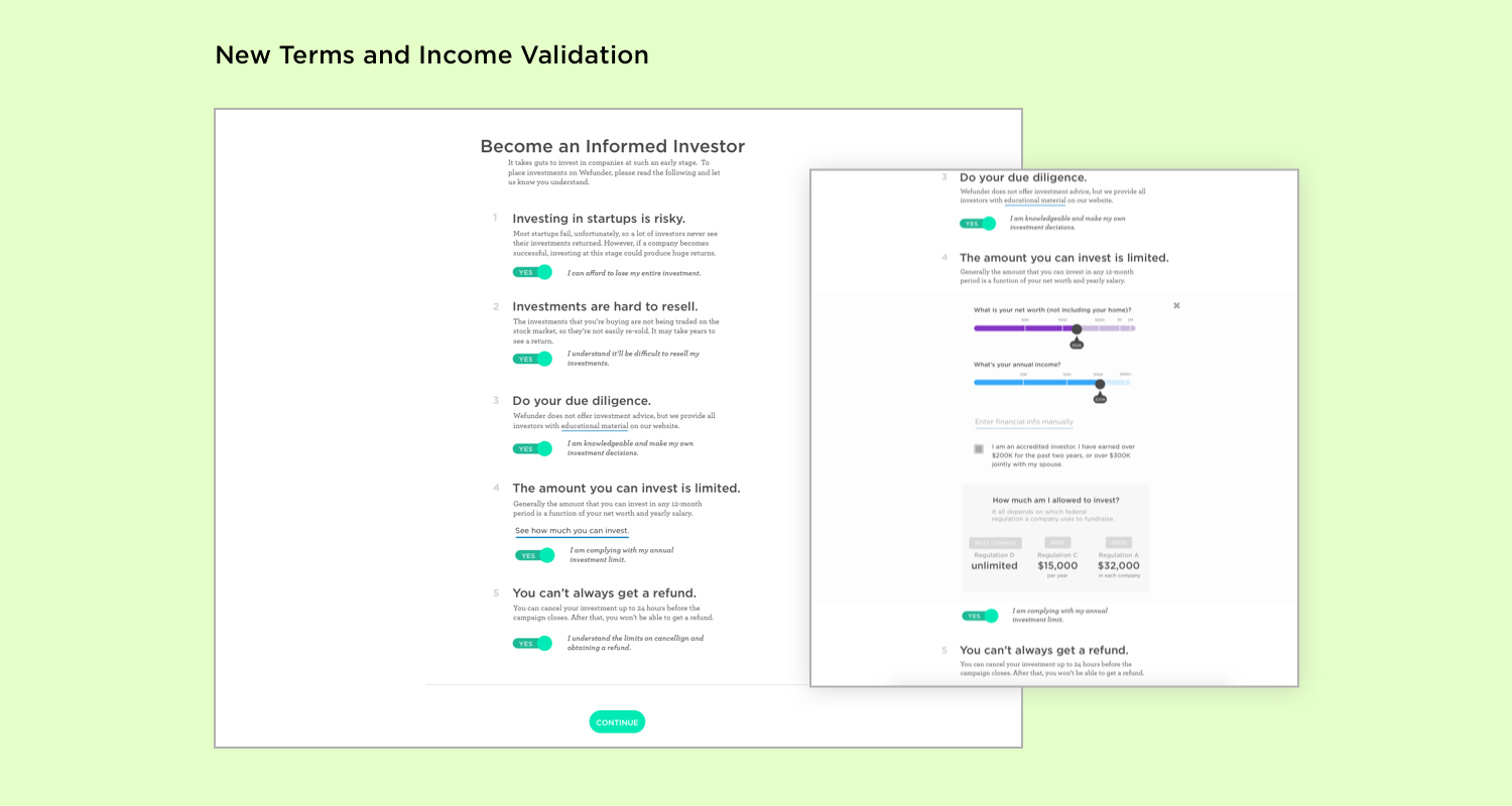
The new terms page appears before the invest page in the invest flow for first time investors. Because investing in a startup is very different from other forms of investment, it is imperative that new investors understand what they're committing to. The information is required by the SEC and the language is written in legalese, which make it difficult to understand. In order to make the information more accessible, I encouraged the client to use plain language.
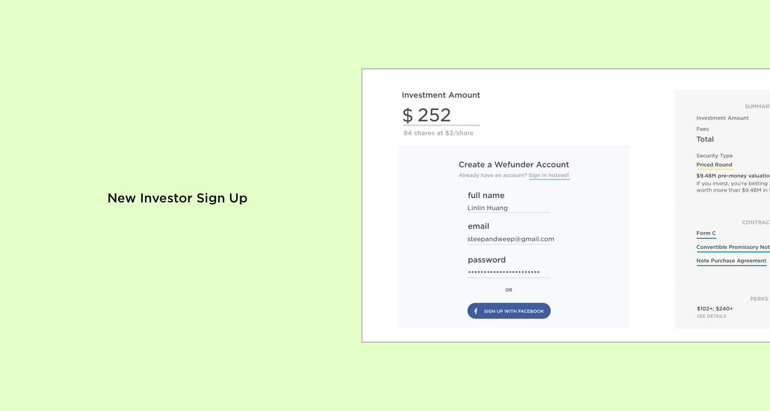
Instead of inserting new users to the platform into a different flow after they click and try to invest, the new design integrates a simple account creation step into the invest page. An important limitation the engineers had was the need to associate an investment to an existing account; therefore, the users must create an account before making an investment.
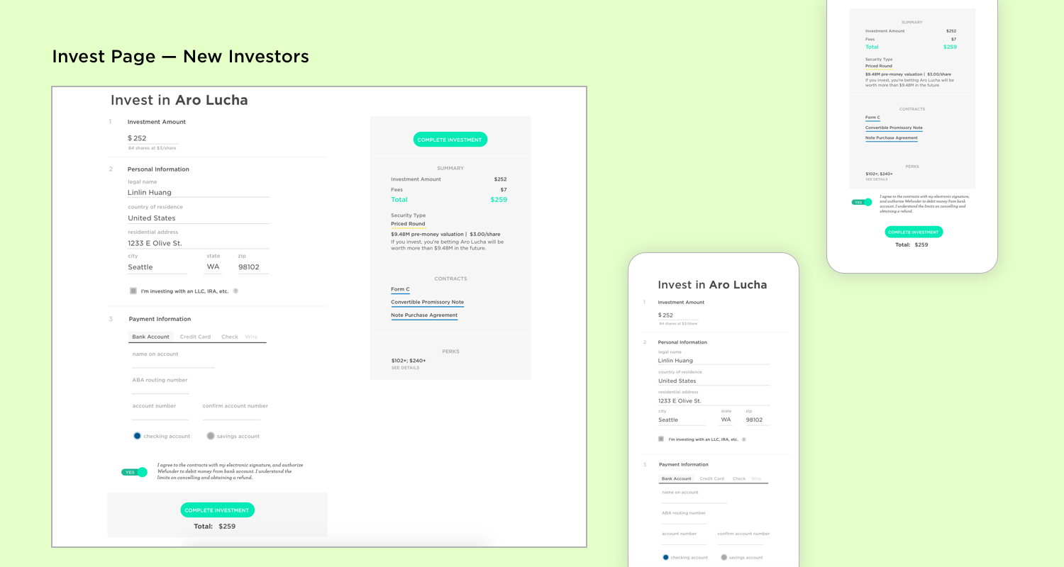
The redesigned invest page for new investors has an updated UI which organized the information for easy scanning. This is the step in which the user needs to provide the most information. It was also the step that had the highest bounce rate before. The redesign aimed to simply the form and make the page more visually appealing to improve engagement.
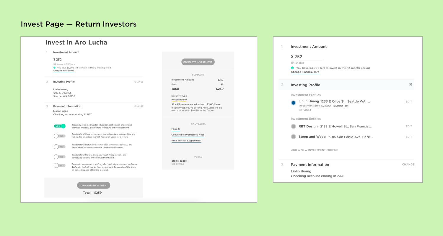
For return investors, the invest page is simplified to a single button click after agreeing to terms as required by the SEC. They can still change their address, invest as an entity by changing their investing profiles, or change payment methods. However, data shows that the majority of the client’s investors used only one profile and one payment method, so those options are minimized.
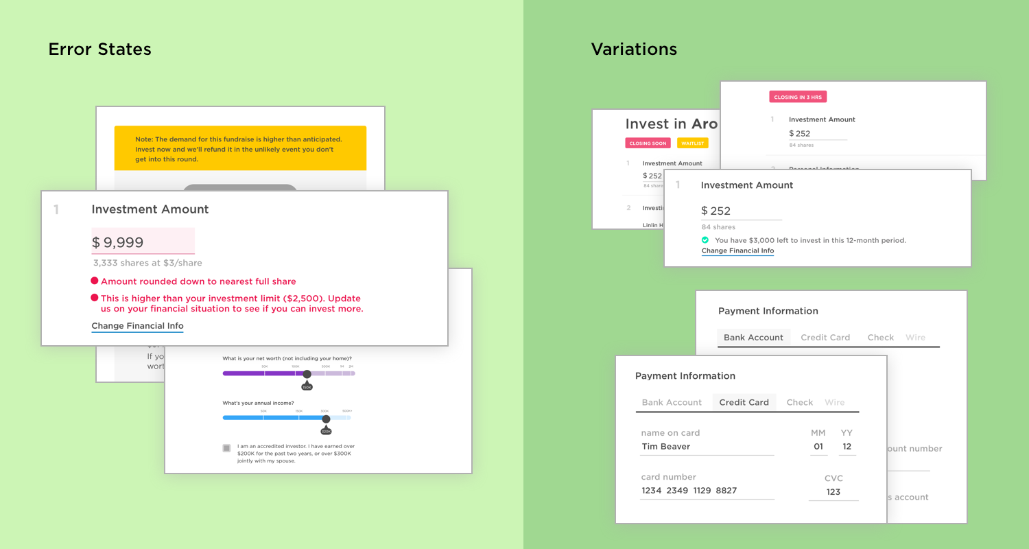
The redesign of the invest flow was very complex and comprehensive, so there were over two dozen variations in the UI to accommodate the flow’s statefulness.
The challenge of this project was the tight timeframe and the availability of user research data. I only had 10 days to complete this project and the user research was limited to google analytics, Full Story session recordings, as well as the support message inbox.
I acted as project manager, UX designer, and UI designer for this project, which allowed me to take full ownership of the project. Being in this role taught me how to be curious and dive deep into the problem, have backbone to back up my decisions, iterate on critical feedback from the devs and the CEO, and deliver results on a tight schedule.
